Posts

Showing posts from March, 2019

BW to Color

Image
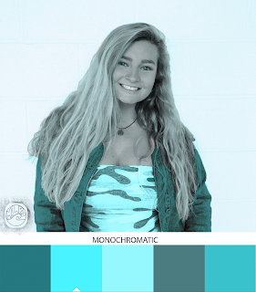
ORIGINAL This project was difficult to me when starting out, but it got easier and easier as it went on. I learned a lot about using the quick selection tool which will be helpful for the future. I used a light blue as my base color for all of the different schemes. My favorite is the monochromatic, because the colors all are very similar and cohesive. This was not my favorite project, but I improved my skills along the way and I am happy with my final outcome.

Tag Brush

Image
This is my logo as a tag brush, which will be my brand from now on. Overall, I am pretty happy with the outcome. I chose to use the Spray 2 option because it went better with my logo, as well as subtle scratches and negatives. I like how I can layer the colors to create a cool effect that is one of a kind. I am excited to put my brand on my future work using this brush.

Photoshop Tutorials

1.) https://www.photoshopessentials.com/basics/how-to-use-paint-symmetry-in-photoshop-cc-2019/ This tutorial taught me how to use the symmetry effect in the paint tool of Photoshop. I like this tutorial because I love creating mandalas and this is a design that I would definitely like to use in my future work. 2.) https://helpx.adobe.com/photoshop/how-to/layer-mask.html?playlist=/ccx/v1/collection/product/photoshop/topics/layer-masking-projects/collection.ccx.js&ref=helpx.adobe.com This tutorial taught me how to make a layer mask and the functions of layer masks. I enjoyed this tutorial because I am a beginner to Photoshop and the more I understand the different functions, the easier it will be for me to use the program. 3.) https://helpx.adobe.com/photoshop/how-to/use-quick-selection-tool.html?playlist=/ccx/v1/collection/product/photoshop/topics/selections/collection.ccx.js&ref=helpx.adobe.com This tutorial taught me how to use the quick selection tool. I think this

Poster Project-Illustrator

Image
Hours: 9 est. For the poster project, I decided to make my message about the environment because it is a topic that I am passionate about. The quote is one of my favorites, talking about how humans seem to think that they are superior when they should be respecting the earth more. I included flowers, stars, and a sketch of the  earth in order to match the theme. For my self portrait, I chose a photo where I was soaking up the sun. In this photo, I am truly happy and at peace, enjoying nature and everything that it has to offer. I used the image trace tool in order to add the effect and the grayscale color theme because I did not want the photo to take too much attention away from my message. Overall, I enjoyed this project. It was nice to turn an issue that I am passionate about into a real image. I most enjoyed using the paint tool to write out the words, because I enjoy calligraphy and writing in different fonts. I am happy with the final outcome of my poster project

Gradient Mesh Project

Image
Hours: 8 est. For the gradient mesh project, I found a picture online of two cherries (the second picture). Professor Roundtree said that we had the option to find a picture online, so I found an object that shows reflection and depth.  I first used the pen tool to create an outline of the shape. I then used the eyedropper tool to use the exact colors from the original photo. I then played around with the gradient mesh tool and tried to copy the reflections and colors as best as I could. Overall, I am extremely happy with the outcome of my project. I was very nervous about using the mesh tool, but once I understood how it worked, it was fun bringing these cherries to life. My creation looks very realistic in my eyes and  I am excited to work with the gradient mesh tool in the future.

Logo Project

Image
Hours: 6 est. Here are my original sketches for my logos, the three black and white designs, and my final logo with three different color schemes. I kept with the beach theme for my colors in order to maintain the look that best represents me.  The first logo is my favorite due to the pattern in the wave. The pattern reminds me of the flow  of the ocean so I found it very fitting. I used pastel colors, and the orange contrasts the blue, helping my initials stand out. The second logo shows the sunset with a gradient filling. I made an orange sunset design in the sky and blue gradients in the water. The gray blends very well with the other colors, allowing the letters to stand out but not be too obnoxious. The third logo stands out a little bit more which I like. I used brighter colors and another gradient for the wave. The pink contrasts well with the white and blue sky. I also like how the black makes the logo stand out more all together.  I enjoyed this pr