Logo Project
Hours: 6 est.
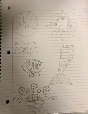
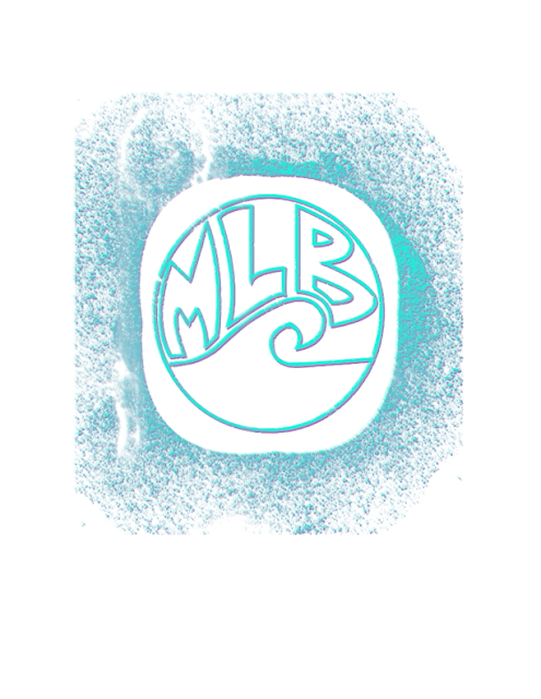
Here are my original sketches for my logos, the three black and white designs, and my final logo with three different color schemes. I kept with the beach theme for my colors in order to maintain the look that best represents me.
The first logo is my favorite due to the pattern in the wave. The pattern reminds me of the flow of the ocean so I found it very fitting. I used pastel colors, and the orange contrasts the blue, helping my initials stand out.
The second logo shows the sunset with a gradient filling. I made an orange sunset design in the sky and blue gradients in the water. The gray blends very well with the other colors, allowing the letters to stand out but not be too obnoxious.
The third logo stands out a little bit more which I like. I used brighter colors and another gradient for the wave. The pink contrasts well with the white and blue sky. I also like how the black makes the logo stand out more all together.
I enjoyed this project because I got to make something that really represents me and who I am. I also loved playing around with the different colors and creating different combinations.


Comments
Post a Comment